


Far Away & Close Together
Far Away & Close Together
Info
For this book design project, the cover gradient draws inspiration from the Maria sunset, capturing the serene beauty of that moment. The title reflects the significance of this being the first trip after the pandemic, symbolizing a sense of distance yet newfound closeness. The book is uniquely designed with two orientations from the front and back, with no specific timeline or order, inviting readers to experience it in their own way.
For this book design project, the cover gradient draws inspiration from the Maria sunset, capturing the serene beauty of that moment. The title reflects the significance of this being the first trip after the pandemic, symbolizing a sense of distance yet newfound closeness. The book is uniquely designed with two orientations from the front and back, with no specific timeline or order, inviting readers to experience it in their own way.
Services
Services
Graphic Design
Graphic Design
Client
Client
NA
NA
Year
Year
2022
2022
Partnership
Partnership
Rapt Studio
Rapt Studio
More
projects

Art Direction
/
Rebrand
Workshape

Brand Identity
/
Web Design
Bishop Ranch
Creative Directon
/
Brand Identity
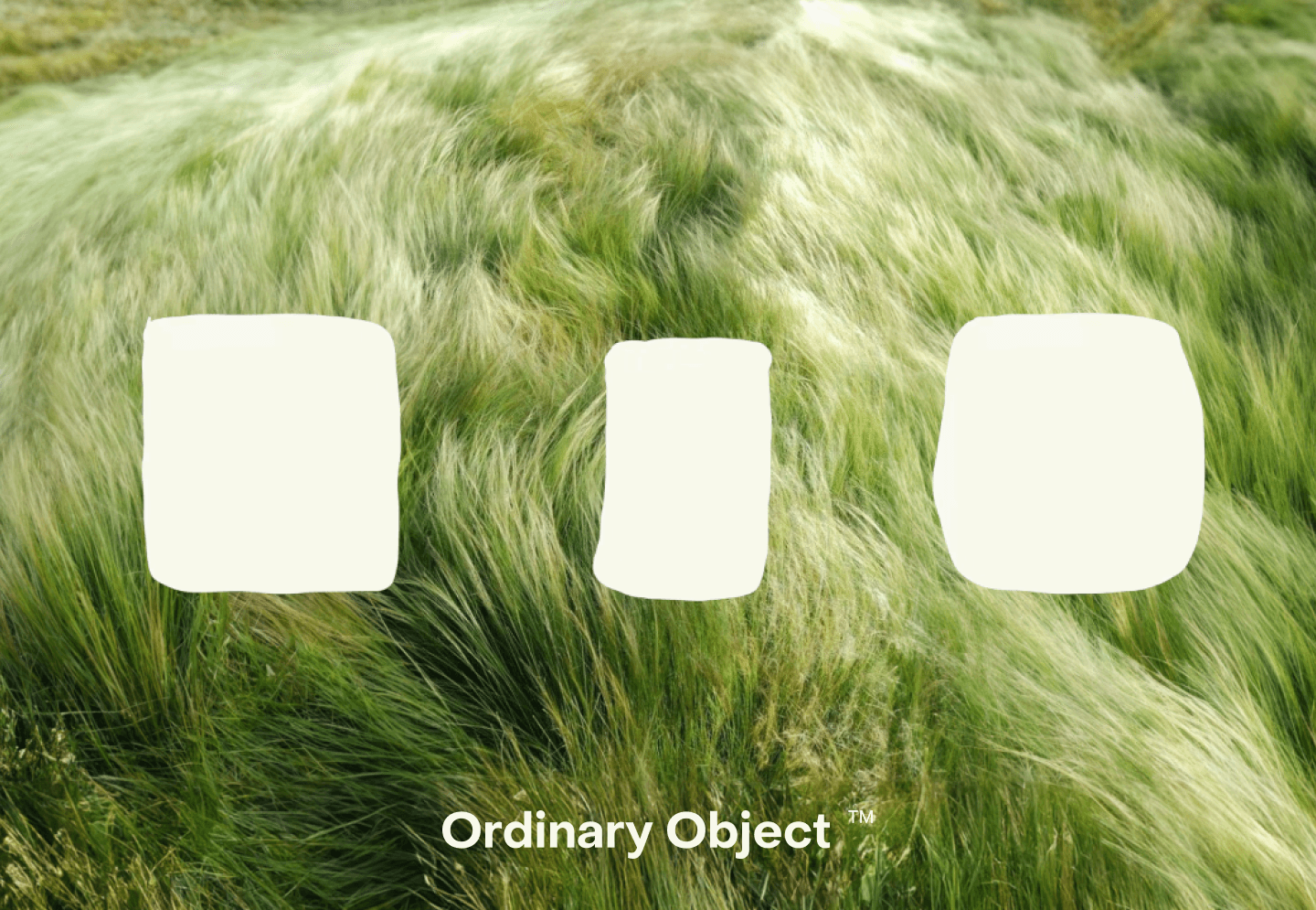
Ordinary Object

Art Direction
/
Brand Identity
Base
Art Direction
/
Logo Design
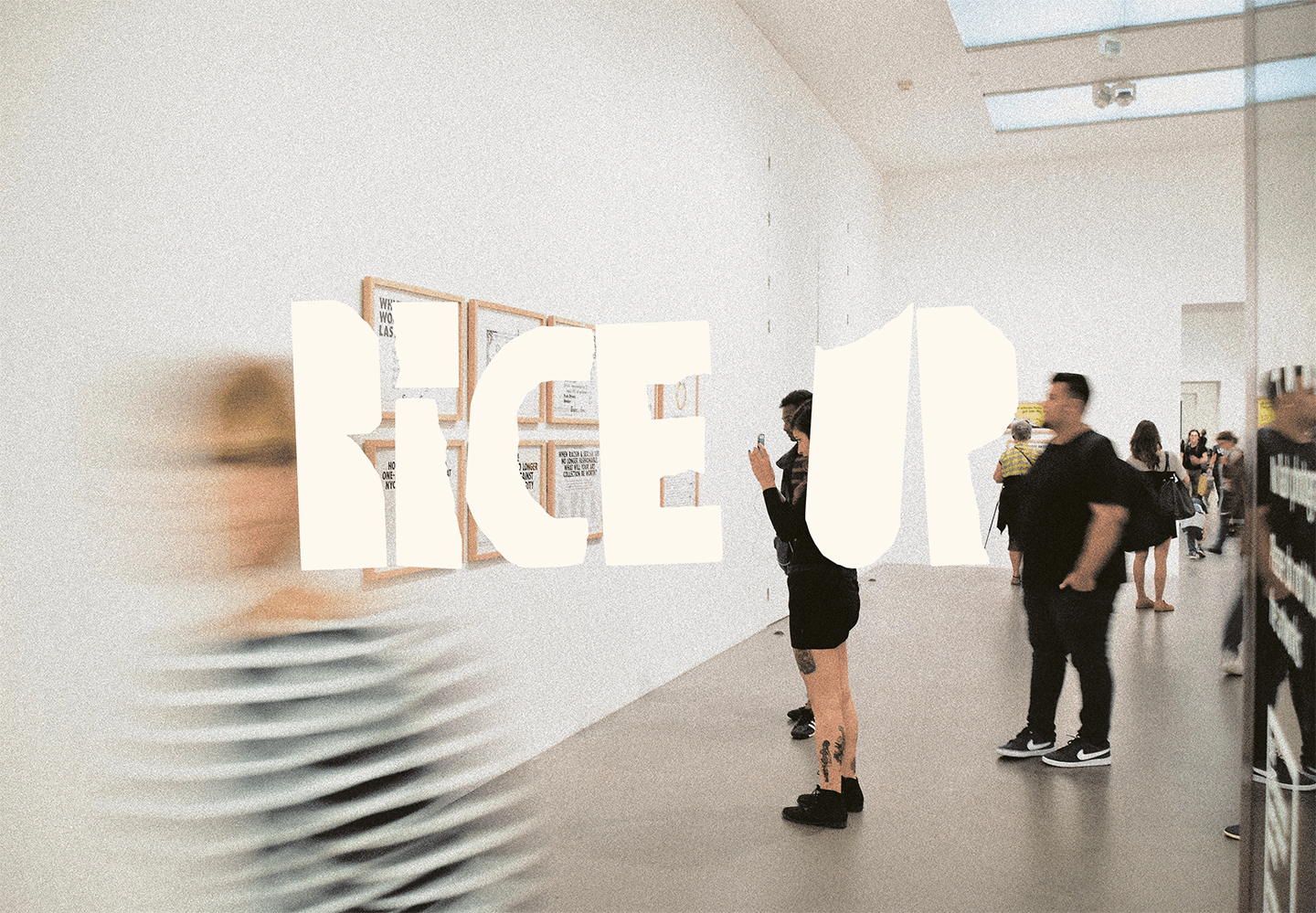
Rice Up

Art Direction
/
Brand Identity
Metro High School

Art Direction
/
Brand Identity
Outlier Effect

Art Direction
/
Brand Identity
Phil & Viv's Cafeteria
Brand Identity
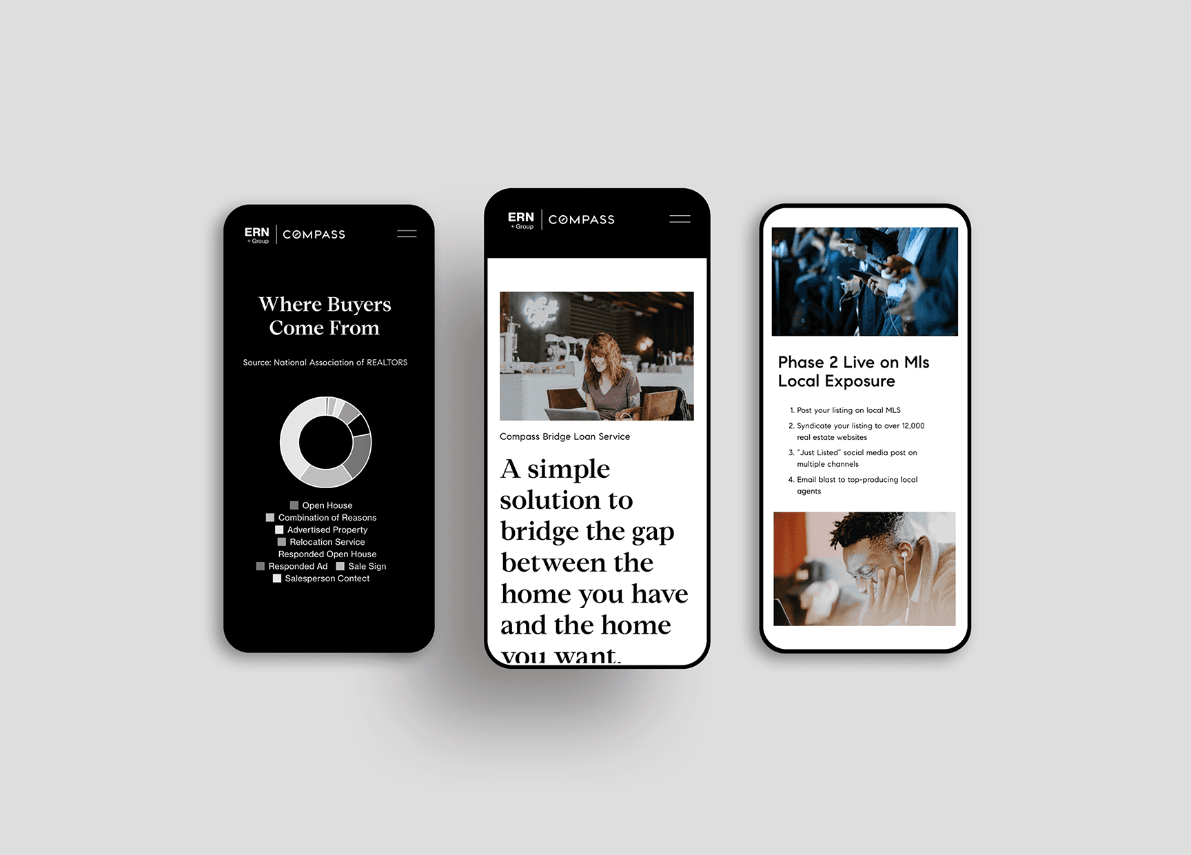
ERN
Illusration
Illustrations Archive

Art Direction
/
Brand Identity
Charms Club
Art Direction
/
Rebrand
Workshape
Brand Identity
/
Web Design
Bishop Ranch
Creative Directon
/
Brand Identity
Ordinary Object
Art Direction
/
Brand Identity
Base
Art Direction
/
Logo Design
Rice Up
Art Direction
/
Brand Identity
Metro High School
Art Direction
/
Brand Identity
Outlier Effect
Art Direction
/
Brand Identity
Phil & Viv's Cafeteria
Brand Identity
ERN
Illusration
Illustrations Archive
Art Direction
/
Brand Identity
Charms Club